HomeJavaModsSkDialogs
SkDialogs
ModsJava

SkDialogs

Create dialog forms, button menus, and confirmation pop-ups in plain Skript, and read every input a player submits.

Which build do you need?

This mod ships a separate file for every mod loader and every version of the game. Pick both, then download — the wrong build installs fine and then does nothing in the game.

Mod loader

Minecraft version

⬇ Download for 26.1.1–26.2 · Paper⬇ Download for 26.1 · Paper⬇ Download for 1.21.8–1.21.11 · Paper⬇ Download for 26.1.1–26.2 · Purpur⬇ Download for 26.1 · Purpur⬇ Download for 1.21.8–1.21.11 · Purpur
I don't know my version or loader
Open the Minecraft launcher and look at the profile you play on — it names both, like fabric-loader-1.21.4. The version also shows in the bottom-right corner of the game's main menu.
No loader in the profile name? Then it's plain Minecraft, and these mods won't run — you need Fabric or NeoForge installed first.
SkDialogs — screenshot 1SkDialogs — screenshot 2

SkDialogs

build paper-api

A Skript addon for Paper's dialog API, the modal windows added to Minecraft in 1.21.6. It adds the syntax to build and show them from a script: forms with text fields, toggles, sliders, and dropdowns, buttons that run commands or open other dialogs, and a click event with everything the player entered.

For example, rules every player must accept before playing:

on join:
    if {rules accepted::%player's uuid%} is true:
        stop
    create dialog "rules":
        set title to "&6Server rules"
        set close on escape to false
        add body "&71. Be kind."
        add body "&72. No griefing."
        add button "accept" labeled "&2I accept the rules"
        add button "decline" labeled "&cDecline"
    show dialog "rules" to player

on dialog click "rules":
    if the clicked button is "accept":
        set {rules accepted::%event-player's uuid%} to true
        send "&aThanks for accepting. Have fun!" to event-player
    else:
        kick event-player due to "&cYou must accept the rules to play."

Install

  1. Install Skript 2.12 or newer on Paper 1.21.8 or newer.
  2. Drop skdialogs-<version>.jar from the latest release into plugins/.
  3. Restart the server.

Every example on this page is complete. Paste one into a file in plugins/Skript/scripts/, run /sk reload all, and try it in game. examples/ has all of them as files, plus a few bigger ones.

How it works

Every dialog follows the same three steps.

  1. create dialog "id": defines a dialog and registers it under an id. The lines inside the section set its title, content, inputs, and buttons.
  2. show dialog "id" to player displays it. One dialog can be shown many times, to any players.
  3. on dialog click "id": fires when a button is pressed. Inside it, the clicked button is the button's id and dialog input "key" is what the player entered.

Buttons can also carry an action (run a command, open a link) and then skip step 3 entirely. All strings go through Skript's chat format, the same as send: & colour codes, hex colours, and tags like <translate:item.minecraft.filled_map>, which each client renders in its own language.

Ask for input

A dialog can hold four kinds of input: a text field, a toggle, a slider, and a dropdown. Each input has a key, and the click handler reads each value by that key.

command /character:
    trigger:
        create dialog "character":
            set title to "Create your character"
            add body "This cannot be changed later."
            add text input "name" labeled "Name" with default "%player%" with max length 16
            add toggle input "hardcore" labeled "Hardcore mode?" with default false
            add slider input "level" labeled "Starting level" from 1 to 10 with step 1 with default 1
            add dropdown input "class" labeled "Class" with options "knight", "ranger" and "mage" with default "knight"
            add button "confirm" labeled "&2Confirm"
        show dialog "character" to player

on dialog click "character":
    set {_name} to dialog input "name"
    set {_class} to dialog input "class"
    set {_level} to dialog input "level"
    send "&aWelcome, %{_name}% the %{_class}%, starting at level %{_level}%." to event-player

A dropdown can also list its choices as a section, so each choice shows a label different from the id you read back:

            add dropdown input "class" labeled "Class":
                option "knight" labeled "&fThe Knight" as default
                option "ranger" labeled "&aThe Ranger"
                option "mage" labeled "&bThe Mage"

Buttons that act on their own

A button with an action clause needs no click handler. It runs a command, opens a link, copies text, pre-fills the chat box, or opens another dialog.

command /menu:
    trigger:
        create dialog "menu":
            set title to "&6Server menu"
            add button labeled "&aSpawn" that runs "/spawn"
            add button labeled "&bWiki" that opens "https://docs.papermc.io"
            add button labeled "Copy server IP" that copies "play.example.com"
            add button labeled "Message an admin" that suggests "/msg admin "
            add exit button "close" labeled "Close"
        show dialog "menu" to player

that runs can take input straight from the dialog. A $(key) placeholder is filled with that input's value at click time, which turns a dialog into a form that submits to a command:

command /rename:
    trigger:
        create dialog "rename":
            set title to "Rename yourself"
            add text input "name" labeled "New name" with max length 16
            add button labeled "&2Apply" that runs "/nick $(name)"
            add exit button "cancel" labeled "Cancel"
        show dialog "rename" to player

Note the two substitutions in play. $(name) is filled by the dialog when clicked, while Skript's own %player% is filled when the dialog is created.

A menu of dialogs

add dialog "id" to the list turns a dialog into a menu whose entries open other dialogs. A button with that shows links back, so the menu loops.

command /hub:
    trigger:
        create dialog "hub-rules":
            set title to "&eRules"
            add body "1. Be kind.  2. No griefing.  3. Have fun."
            add button "back" labeled "← Back" that shows "hub"
        create dialog "hub-kit":
            set title to "&aStarter kit"
            add button "warrior" labeled "Warrior"
            add button "mage" labeled "Mage"
            add button "back" labeled "← Back" that shows "hub"
        create dialog "hub":
            set title to "&6Server hub"
            add dialog "hub-rules" to the list
            add dialog "hub-kit" to the list
            add exit button "close" labeled "Close"
        show dialog "hub" to player

on dialog click "hub-kit":
    if the clicked button is "warrior" or "mage":
        send "&aYou chose the %the clicked button% kit." to event-player

Keep the dialog open

By default a dialog closes when a button is pressed. set after click to keep open leaves it on screen, so a player can press a button several times and each click re-reads the inputs as they stand.

command /volume:
    trigger:
        create dialog "volume":
            set title to "Music volume"
            set after click to keep open
            add slider input "level" labeled "Volume" from 0 to 100 with step 5 with default 50
            add button "apply" labeled "Apply"
            add exit button "done" labeled "Done"
        show dialog "volume" to player

on dialog click "volume":
    if the clicked button is "apply":
        set {volume::%event-player's uuid%} to dialog input "level"
        send "&7Volume set to &f%{volume::%event-player's uuid%}%&7." to event-player

Syntax reference

The complete set of patterns, in Skript's own notation: [square brackets] are optional, (a|b) is a choice, and %string% is any expression of that type.

Create a dialog

(create|make) dialog [(named|with id)] %string%:

Opens a section that defines a dialog and registers it under the given id. The section body runs once, immediately; only the effects below are valid inside it. Creating a dialog with an id that already exists replaces the old one.

The id is how you refer to the dialog everywhere else: show dialog, on dialog click, that shows, and add dialog ... to the list.

Properties

set [the] title [of [the] dialog] to %string%
set [the] external title [of [the] dialog] to %string%
set [the] columns [of [the] dialog] to %number%
set (closing|close) on escape [of [the] dialog] to %boolean%
set [the] after[ ]click [behaviour|behavior] [of [the] dialog] to (close|keep open|wait [for response])
Property Default Meaning
title the dialog's id Text shown at the top of the window.
external title the title Label shown where a client lists the dialog outside itself.
columns 2 How many columns of buttons a multi-action or list dialog lays out.
close on escape true Whether the escape key closes the dialog.
after click close What the dialog does once a button is pressed.

The after click choices are close (the dialog closes), keep open (it stays on screen, so a player can press a button several times and each click re-reads the inputs), and wait for response (it greys out until the server replies).

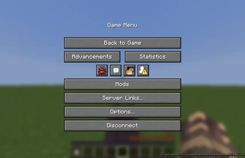
Vanilla's pause-menu and quick-action buttons come from data pack tags resolved at load, so dialogs created at runtime cannot appear there.

Body

add [a] [plain] body %string% [with width %number%]
add [an] item body %itemstack% [with description %string%] [without tooltip] [without decorations] [sized %number% by %number%]

Adds a line of content: a message, or a rendered item. An item's description is shown next to it, without tooltip hides its hover tooltip, without decorations hides its count and durability bar, and sized sets the box it renders in (width by height, 16 by 16 unless set).

Inputs

Every input takes a key (its name in the click event) and an optional labeled label, which defaults to the key.

add text input %string% [labeled %string%] [with default %string%] [with max[imum] length %number%] [with width %number%] [multiline [up to %number% lines]]
add (boolean|toggle) input %string% [labeled %string%] [with default %boolean%] [with values %string% and %string%]
add (slider|number) input %string% [labeled %string%] (from|between) %number% (to|and) %number% [(by|with step) %number%] [with default %number%] [with format %string%] [with width %number%]
add (dropdown|choice) input %string% [labeled %string%] with options %strings% [with default %string%] [with width %number%]
Input Player sees dialog input "key" returns
text a text field, multi-line with multiline the entered text (max length defaults to 32)
toggle an on/off switch true or false
slider a slider over the given range a number
dropdown a list of choices the chosen option's id

A slider without a default starts at the low end of its range. with format shapes the slider's label, with {label} and {value} marking the substitutions, e.g. with format "{value} blocks". A toggle's with values sets what a $(key) command placeholder becomes for each state, e.g. with values "64" and "1" instead of true and false.

A dropdown can also list its choices as a section, so each choice shows a label different from the id you read back:

add (dropdown|choice) input %string% [labeled %string%]:
    option %string% [labeled %string%] [[as] [the] default]

Buttons

add [a] button [%string%] [labeled %string%] [with tooltip %string%] [with width %number%] [that (runs|opens|copies|suggests|shows) %string%]
add [an] exit button [%string%] [labeled %string%] [with tooltip %string%] [with width %number%]

The label defaults to the id. What a button does depends on its action clause:

Clause On click
none Fires on dialog click; the id is required so you can match it there.
that runs %string% Runs the command as the player. A $(key) placeholder is filled with that input's value at click time.
that opens %string% Asks to open the url.
that copies %string% Copies the text to the clipboard.
that suggests %string% Pre-fills the chat box with the text.
that shows %string% Opens the dialog with that id.

The exit button is the single back/cancel button a multi-action or list dialog shows below the others; a dialog can have at most one.

that runs runs the command as the player, with the player's permissions, and the client asks the player to confirm a plain command first. Work that needs more permission than the player has belongs in on dialog click instead.

How the dialog is laid out follows from its buttons. No buttons is a plain notice; one button is a notice with that button; one button plus an exit button is a yes/no confirmation; anything more is a multi-action dialog in the configured columns. Setting columns turns a confirmation back into a multi-action.

Dialog lists

add dialog %string% to [the] list
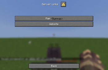
add [the] server links to [the] list

Adds another dialog, by id, as an entry in this dialog's menu. A dialog with any list entries is shown as a list: each entry is a button that opens that dialog. server links instead presents the link list the server advertises.

Server links

add [a] server link labeled %string% to [url] %string%
add [a|the] (bug report|community guidelines|support|status|feedback|community|website|forums|news|announcements) server link to [url] %string%
(clear|delete) [all] [the] server links

Manages the server's link list, shown under "Server Links" in the pause menu and in a server links dialog. Links are server-wide, so on load is the natural place to set them. A typed link is labelled by each client in its own language; a labeled link shows your text, and a <translate:...> tag makes that per-language too. Clearing first lets a reloading script rebuild the list without stacking duplicates.

on load:
    clear the server links
    add server link labeled "<translate:item.minecraft.filled_map>" to "https://map.example.com"
    add website server link to "https://example.com"

Show and close

(show|open) dialog %string% (to|for) %players%
close [the] [current] dialog (for|of|to) %players%

show dialog displays a created dialog; showing to all players works too. close dialog closes whatever dialog each player has open, from any plugin.

The click event

on dialog (click|submit|button click):
on dialog (click|submit) [(of|for)] %string%:

Fires when a player presses an event button (one with no action clause) on a dialog this addon created. The optional id restricts the event to one dialog.

Inside the event:

event-player                                # the player who submitted the dialog
[the] clicked [dialog] button               # the pressed button's id
[the] [clicked] dialog id                   # the dialog's id
[the] [dialog] input [value] [(of|for)] %string%    # one input's value, by key
[the] [dialog] value of [input] %string%            # the same, worded differently

An input's value is a text, a boolean, or a number, matching the inputs table above. Reading a key the dialog does not have gives nothing.

Build

Requires a JDK 25, the version Paper 26.2 needs (the wrapper fetches Gradle itself).

./gradlew build

The jar lands in build/libs/. The addon compiles against the exact Paper build pinned in gradle.properties; to follow a new Paper build, bump that property and fix whatever no longer compiles.

CI builds every push and pull request, and a weekly paper-api job compiles against the latest Paper build, so a breaking change to the experimental dialog API shows up as a failed run instead of a surprise on a server. Pushing a vX.Y.Z tag attaches the jar to a GitHub release and publishes it to Modrinth.

Contributing

Bug reports, feature requests, and pull requests are welcome. See CONTRIBUTING.md for how to set up a dev environment and what a good pull request looks like.

License

MIT

Verified by MCModsHub

These come from our own check of the pack file, not from the source page.

Explore more